

Flexity
Flexity are a team of experts that specialise in delivering advanced new technology solutions that address some of the wicked tech problems of energy transition.
Working with our partners Digital Native we started with a strategic deep dive workshop into the business. Seeking to understand the key drivers to lean into, the pain points and turn-ons for existing and prospective customers, a competitive analysis, brand personality, values, and tone of voice that will enable the company to maximise their growth potential and impact.
This formed the foundation for the creative process and the yardstick to measure it against. Conceptually we wanted to express the ability of the team to get ‘under the hood’ of their customers’ complex challenges within the energy transition space. ‘Peeling back’ the x symbol to reveal the surprise behind was the ideal way to express how they work and the value they bring.
As always the client relationship is key and Directors Nick and Michael were very willing participants, giving great feedback and encouragement throughout.
The new brand has been showcased at several conference events now and the feedback has been extremely positive.
“Thank you so much for the presentation, it certainly has us thinking, but also has us very reassured that what ultimately pops out the end of this process is going to be very professional. Great look and feel, and very appropriate elements.
Great work guys, very impressive”
Nick Yates, Director Flexity
Accelerating the energy transition.
Brand Strategy (with Digital Native)
Brand Identity Creative Direction & Design
Brand Guidelines

Brand Strategy Workshop (conducted with Matt Garden of Digital Native)

Stack of business cards with black and white designs, including colorful accents and the text 'Flexity'.
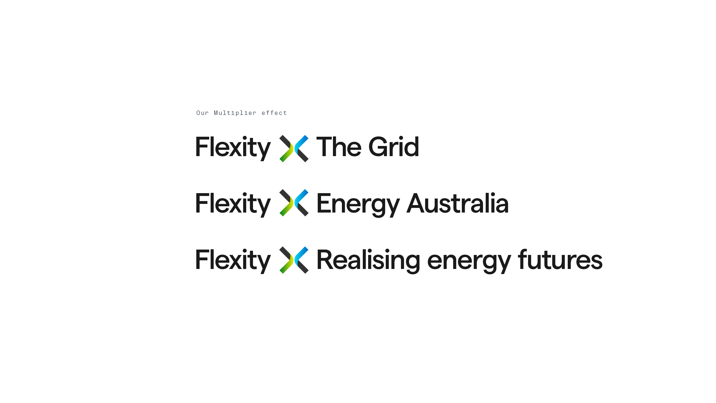
Text on a black background with multicolored Accent X in the middle, reading: "Our Multiplier effect," "Flexity X The Grid," "Flexity X Energy Australia," and "Flexity X Realising energy futures."

Computer screen displaying a website with a background of power lines and a blue sky, and the text 'Accelerating the energy transition' along with a 'Learn more' button.

A colorful abstract logo design with overlapping geometric shapes in black, gray, green, yellow, blue, and dark gray.

A black van with a colorful logo and tagline parked on a street in front of a corrugated metal fence and trees.

A booth or display with the branding 'flexity' and slogan 'Accelerating the energy transition.' The display features a design with a photo of a power transmission tower and power lines on a blue sky background.

A promotional image for Flexity featuring photos of a woman using her laptop by a window, a person charging an electric car, a wind turbine at sunset, and someone doing laundry. The text emphasizes Flexity’s role in energy efficiency and innovation in the energy transition.

A letter from Flexity on a white sheet of paper with the company's logo at the top, placed on a textured surface with blue object on the left side of the image.

Two pages from a presentation or brochure about Flexity, a technology company in Sydney. The left page has a white background with black text discussing assisting rapid and sustainable electrical grid transition, and the Flexity logo at the bottom. The right page has a dark background with gray text titled 'Cleaner Resources,' detailing energy ecosystem acceleration and decarbonisation efforts, with the same Flexity logo at the bottom.

Icon visual language

A digital presentation board displaying brand assets, including a logo design called 'Flexity', color palette, graphic elements, typography, and imagery related to energy networks and technology.

Futuristic diagram of interconnected multiline shapes in black, green, blue, and gray outlines on a black background.