STRONGER, FOR LIFE
VAMOS is an exciting new health concept that connects physical strength training with individual life goals and mental wellbeing.
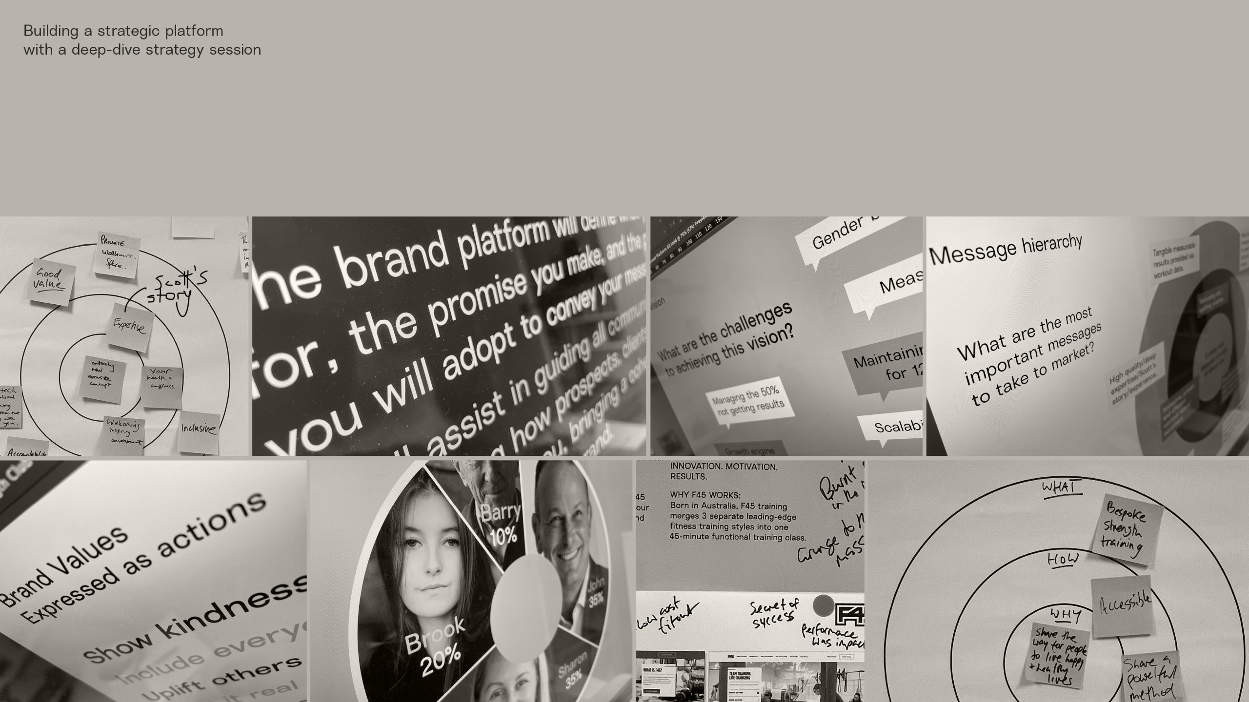
We began the Brand Identity process with a deep-dive strategy session with the founder and his trusted network of advisors. Through this collaborative process we define the business purpose, vision and core values as well as analysing the workings of the target audience and how to engage them, the competitive landscape, unique selling point and key messaging.
This is what we call our Brand Platform. The goal here is to align all stakeholders and set the project up for success through collective research, insight and expertise.
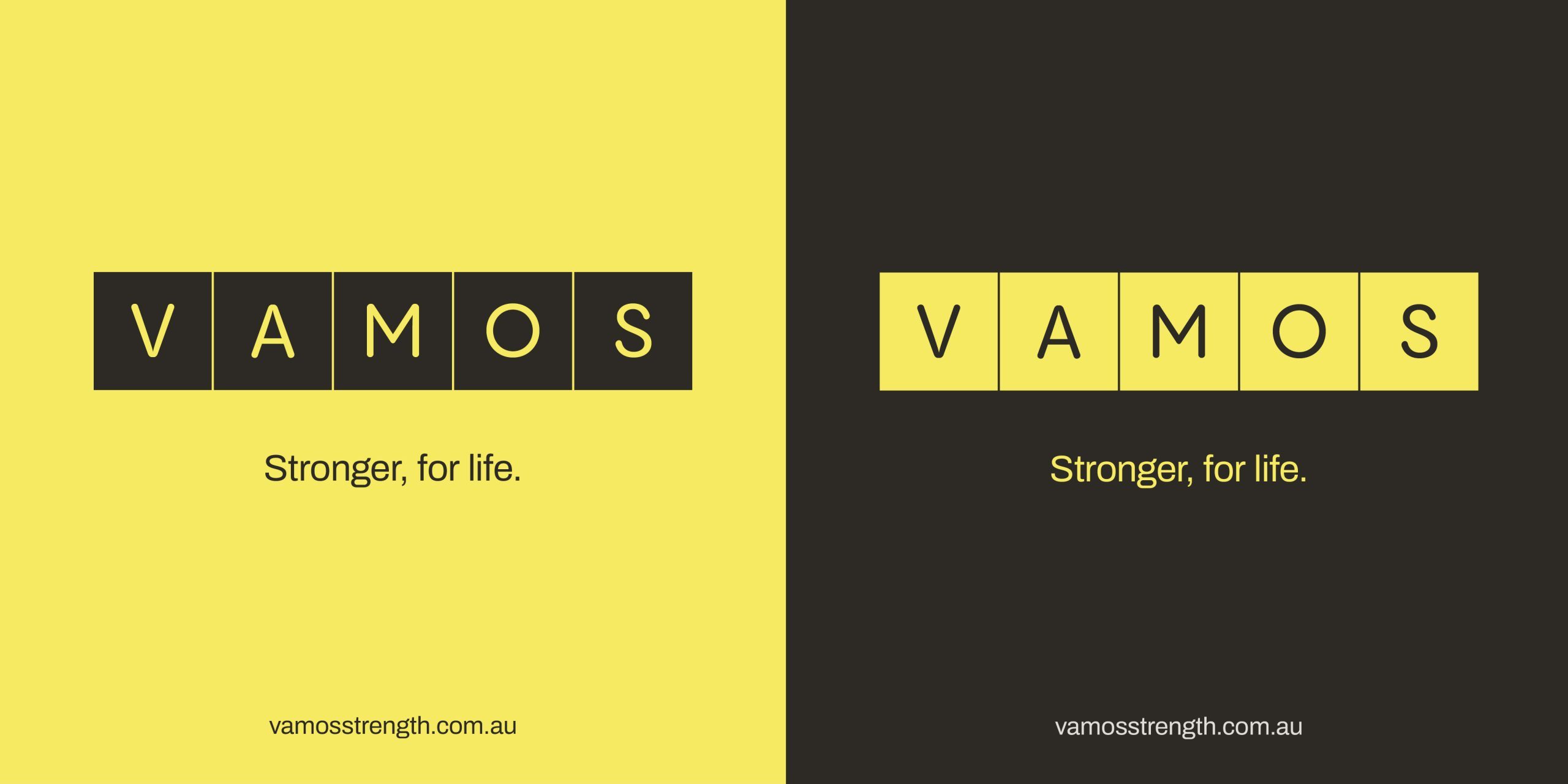
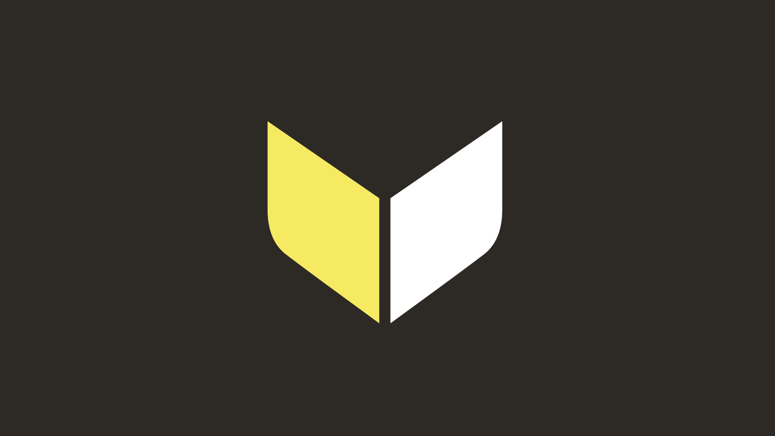
From this solid base we worked through a (very) long list of business name options, finally settling on VAMOS, which spoke to the positive, action-oriented nature of the business.
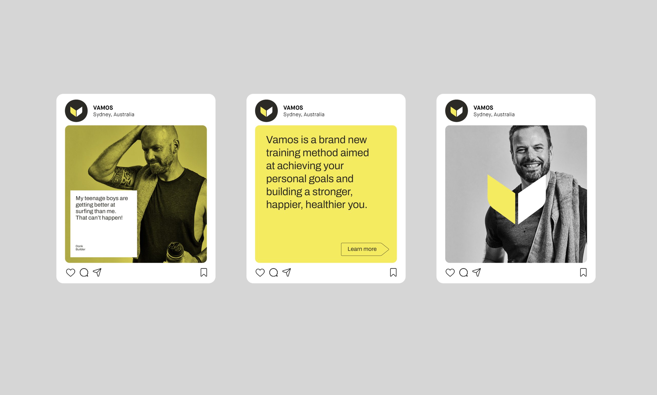
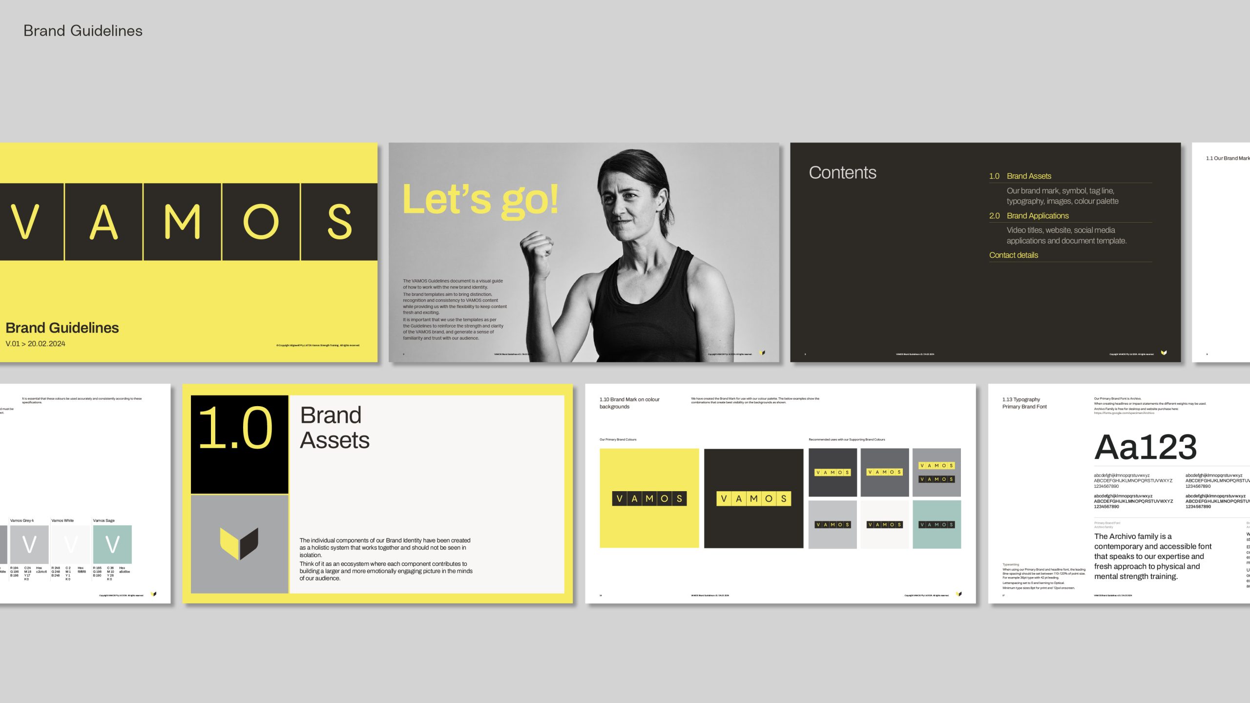
The identity design drew inspiration from the unique individual cubicles that customers can book and the bright yellow that brings energy and positivity to the fore. Our research informed this colour choice as there was a gap in the competitive market that gave us unique ‘ownership’ of our VAMOS Yellow.
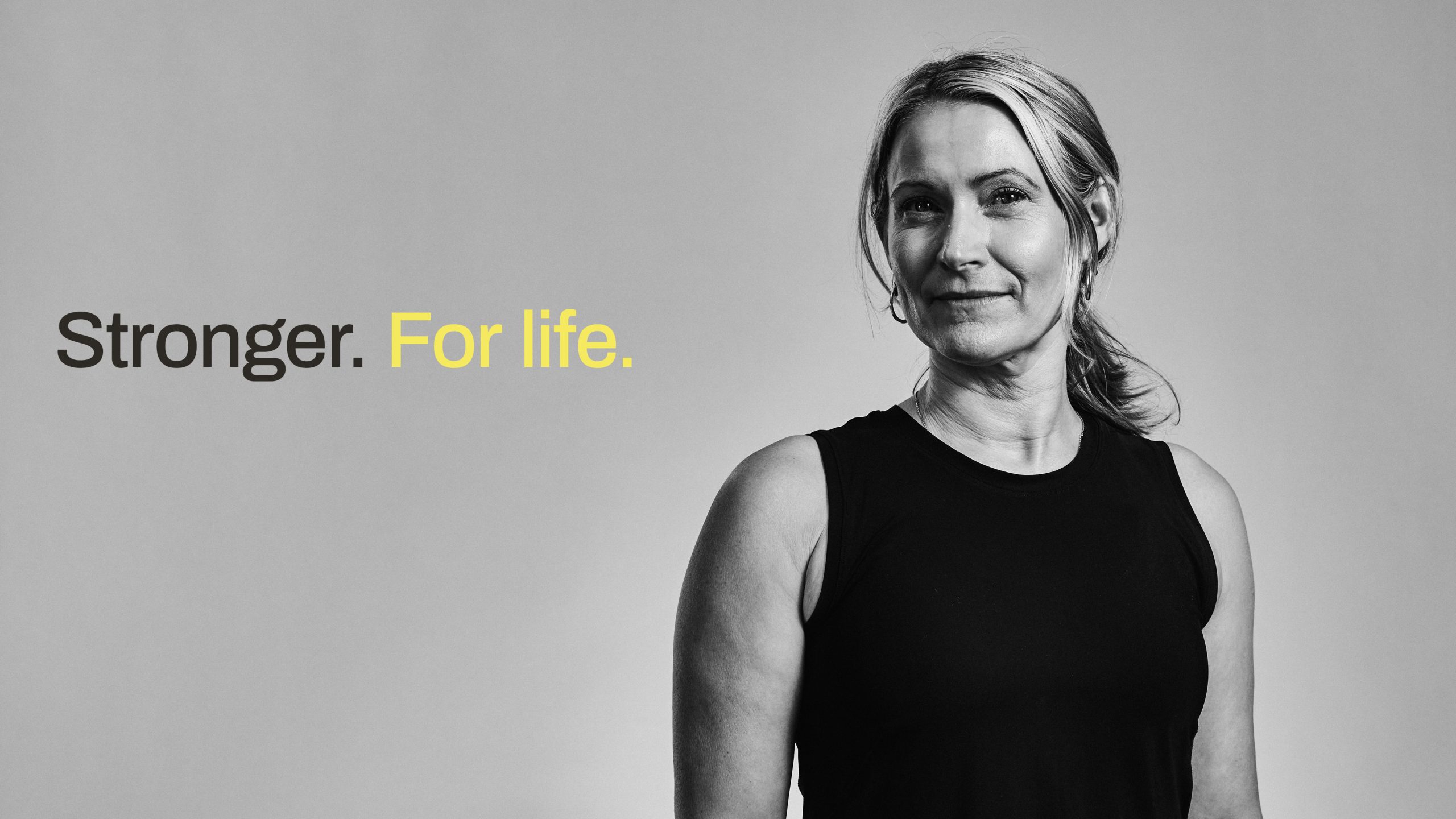
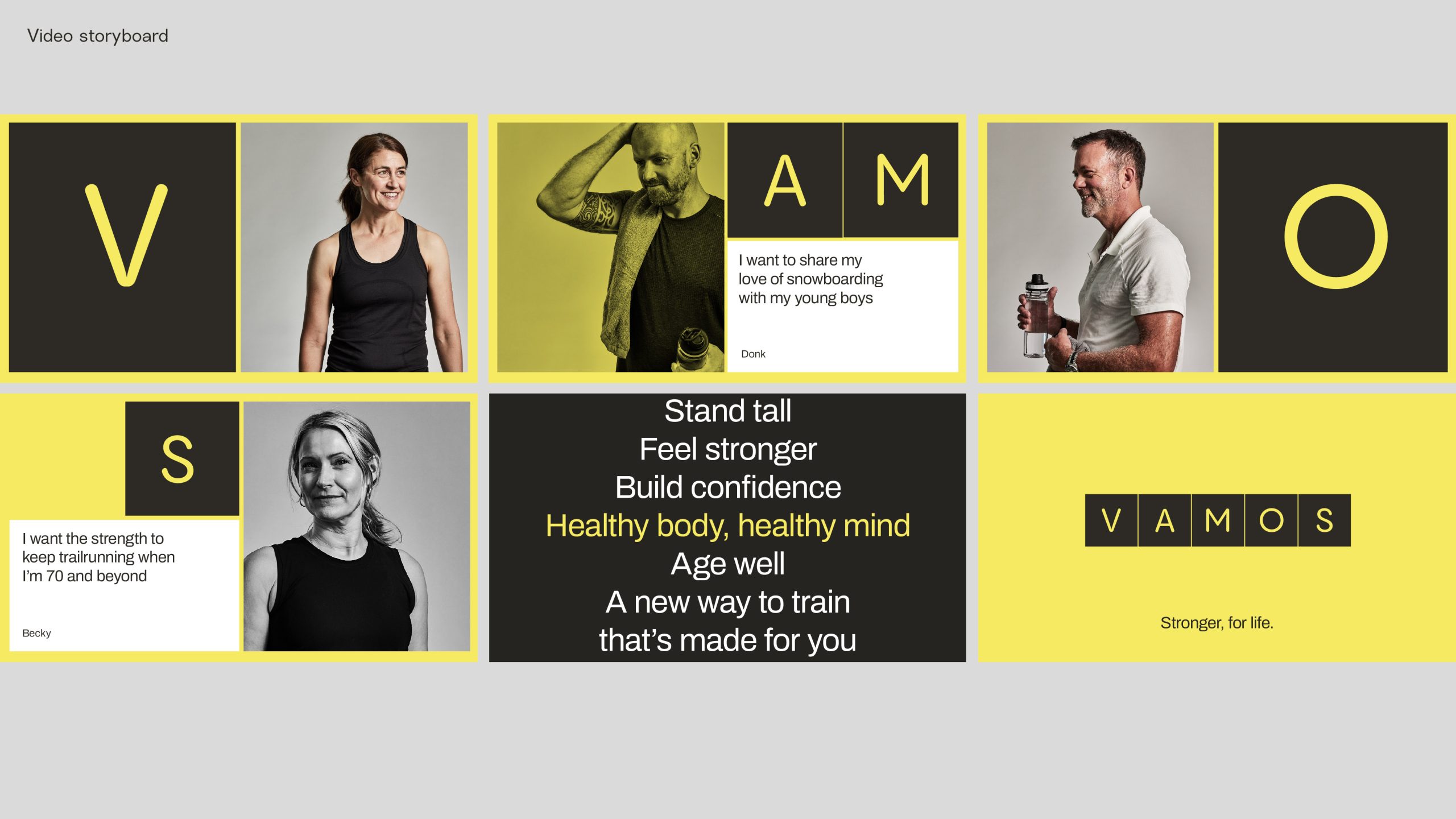
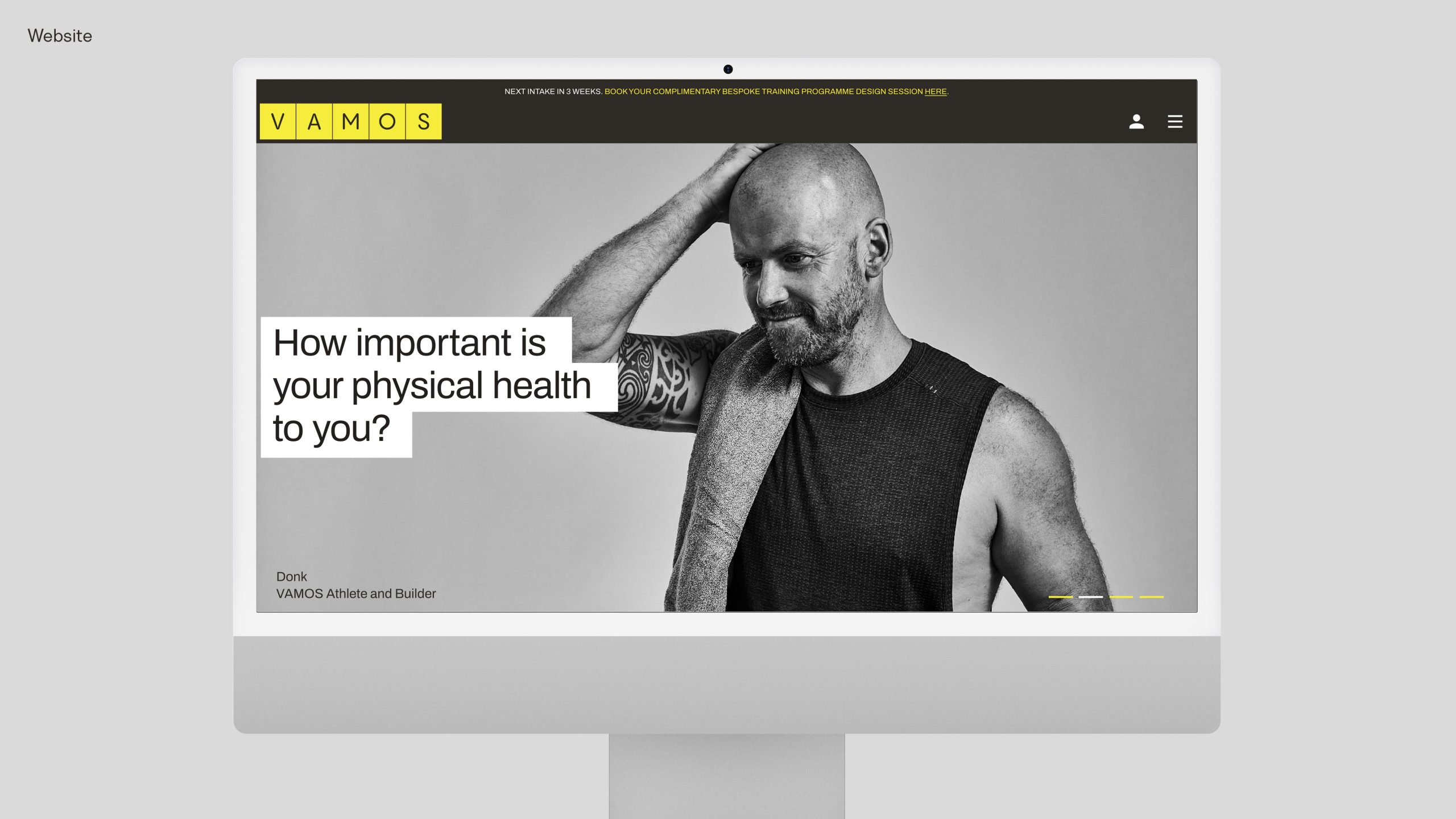
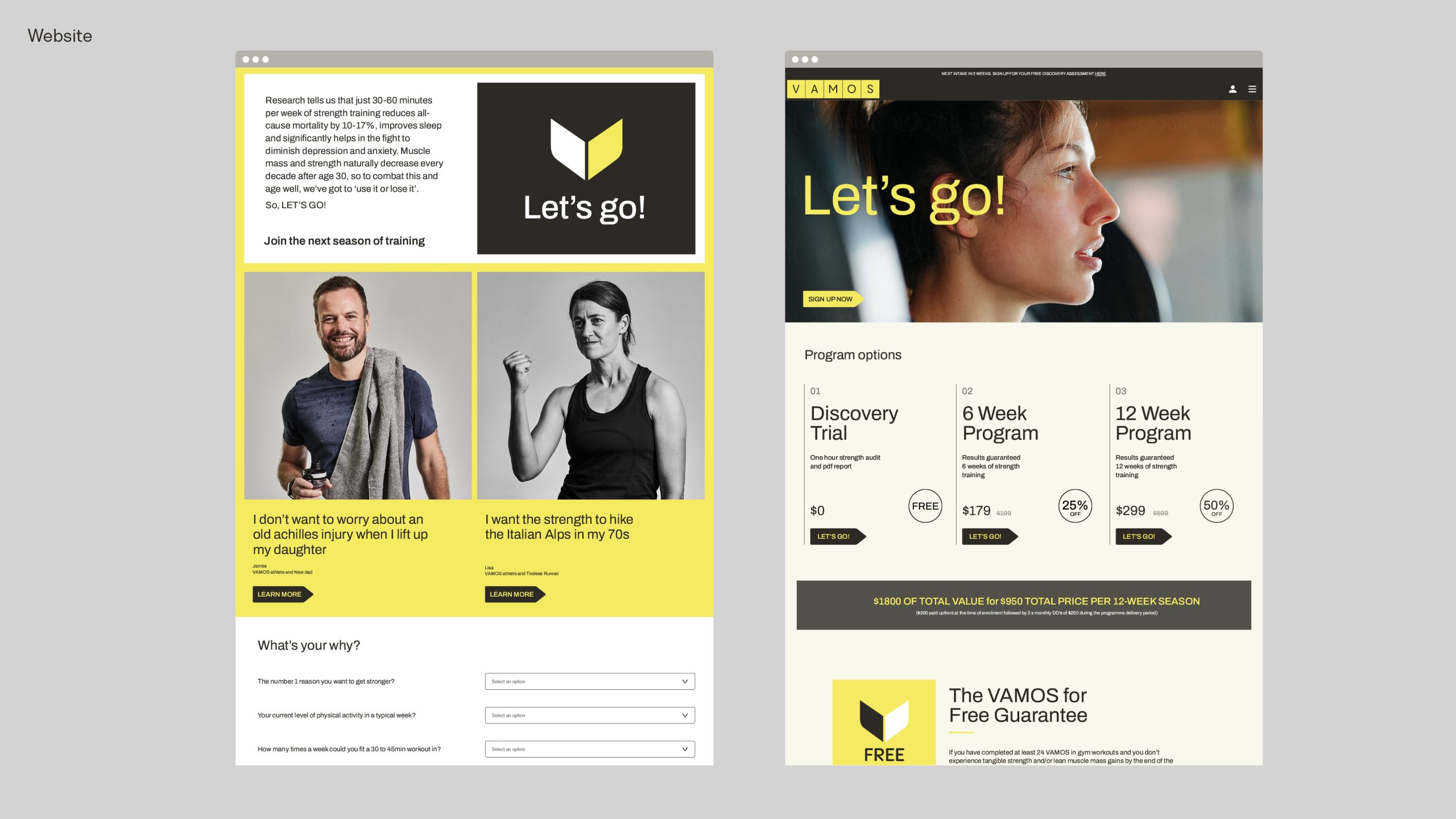
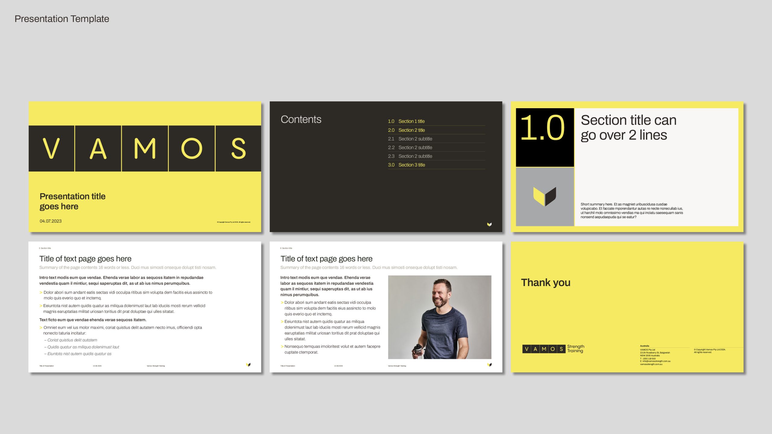
Following on from this we created the full outward-facing expression of who we are, what we’re doing, how we look and what we sound like, through the expanded brand identity, messaging, imagery, colours and typography.
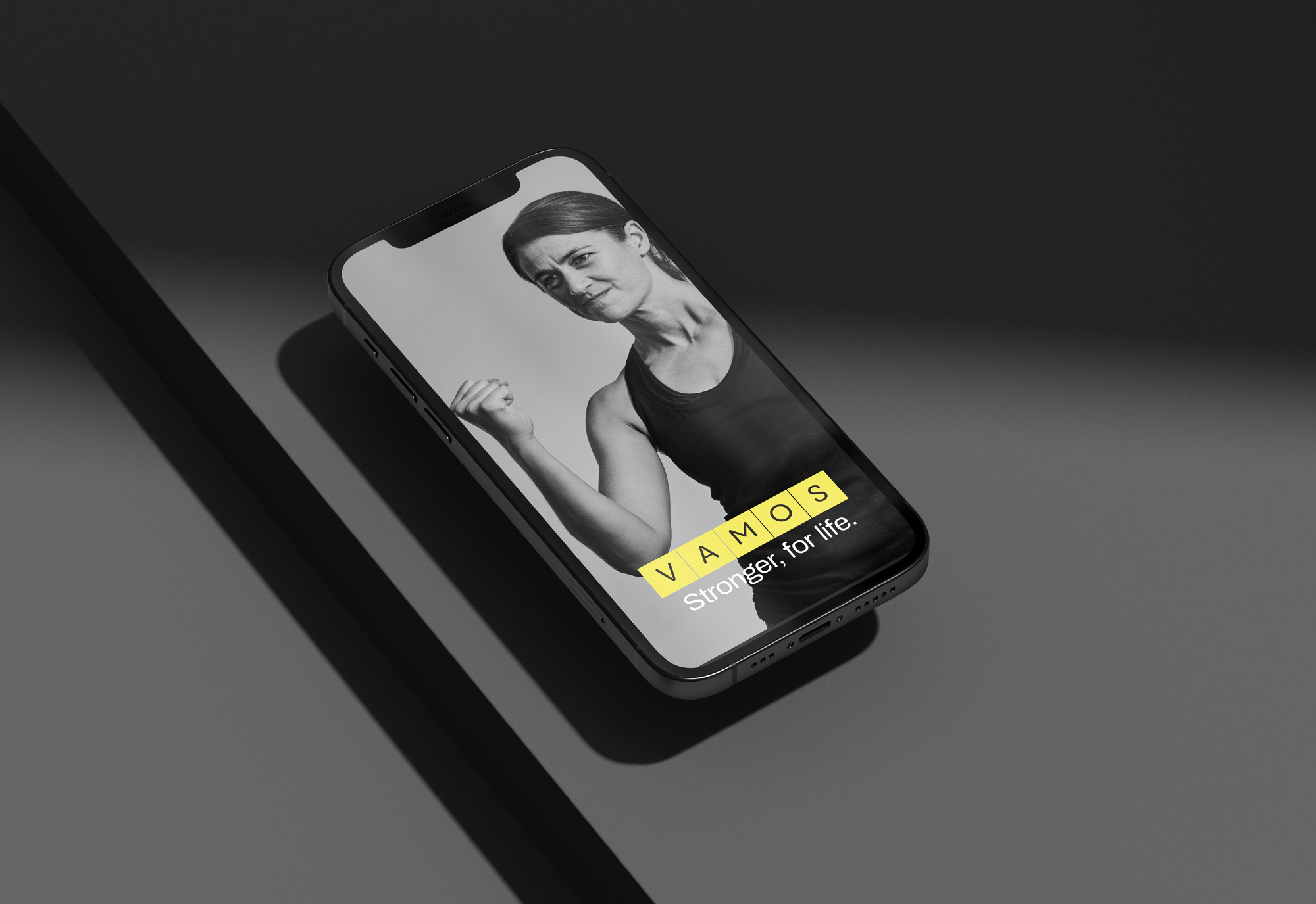
From here we implemented the identity across key customer touchpoints, both digital and physical through unique ownable brand assets such as photography, video, copywriting and more.
Many thanks to clients Scott and Kate for their belief and support for the work, as well as to Gary Walmsley and Ant Geernaert for massive creative contributions to the end product.